Close
Learn more
True Calling needed a brand that could bridge the gap between deep, transformative coaching work and the practical concerns of busy executives. The brand had to feel grounded and accessible, not overly "spiritual", while conveying genuine expertise in guiding leaders through life transitions and burnout recovery.
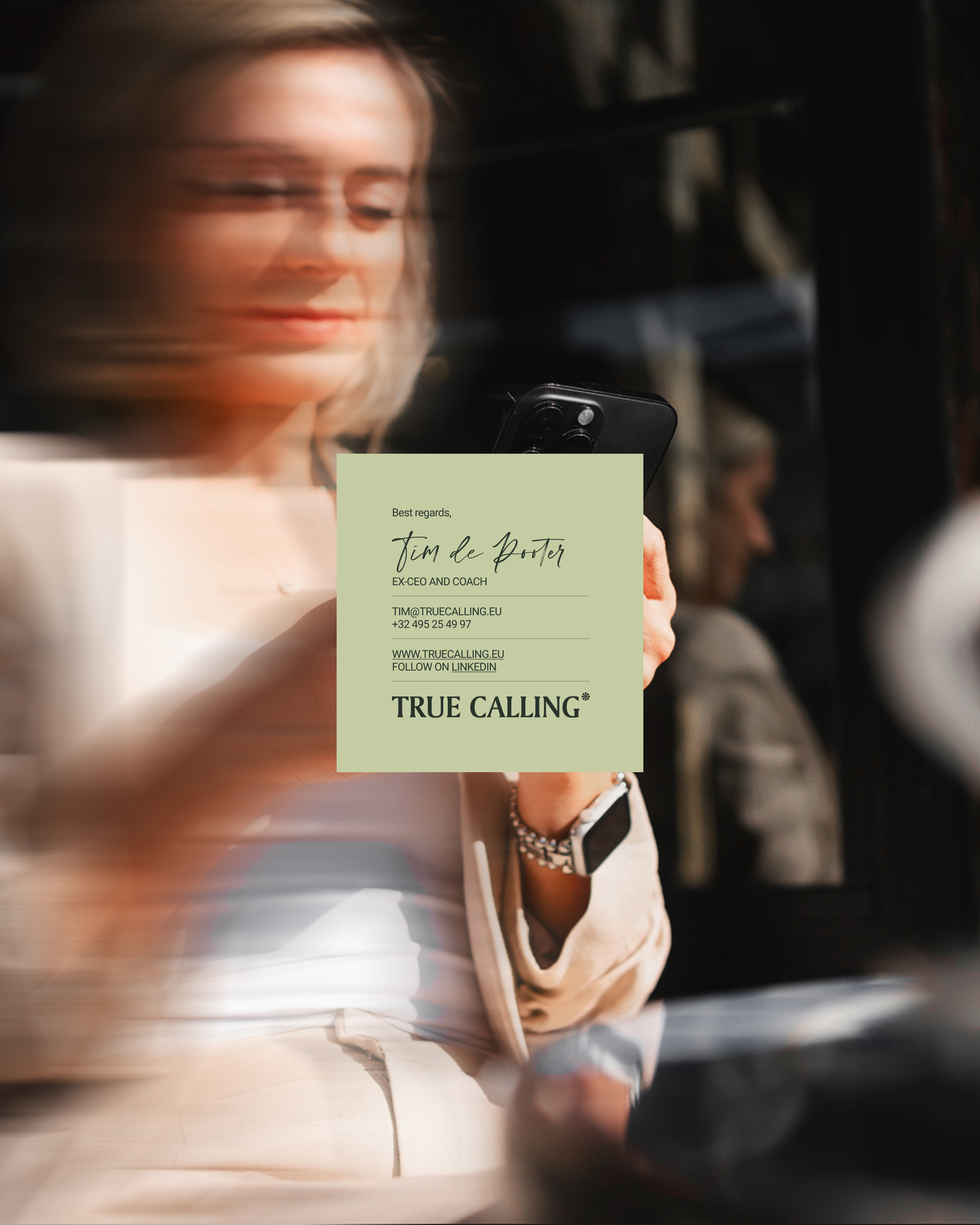
Rather than positioning True Calling as another life coach, we established it as a partner for executive transformation. The positioning centered on a single insight: clarity creates confidence. We built an identity system that reflected this philosophy.
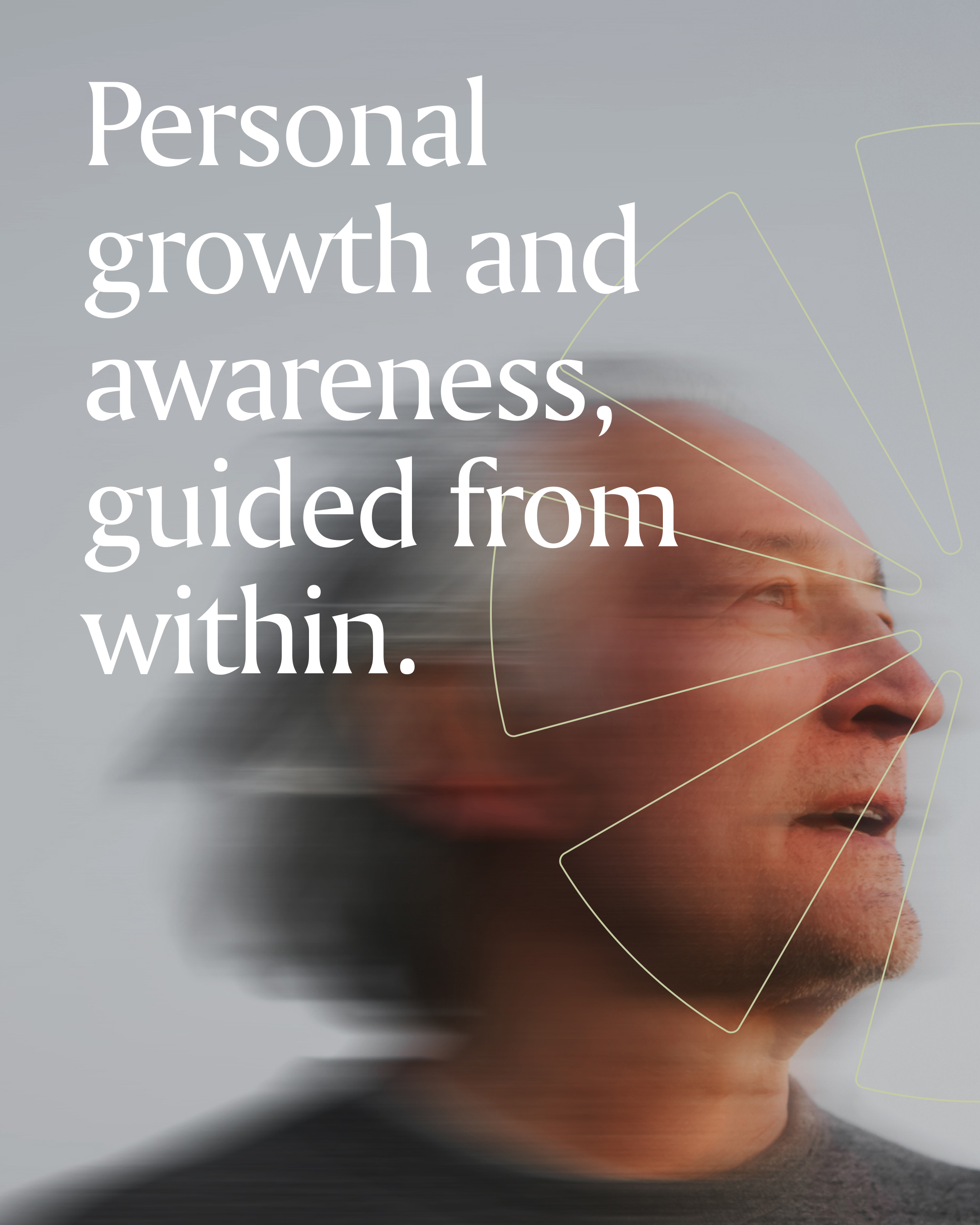
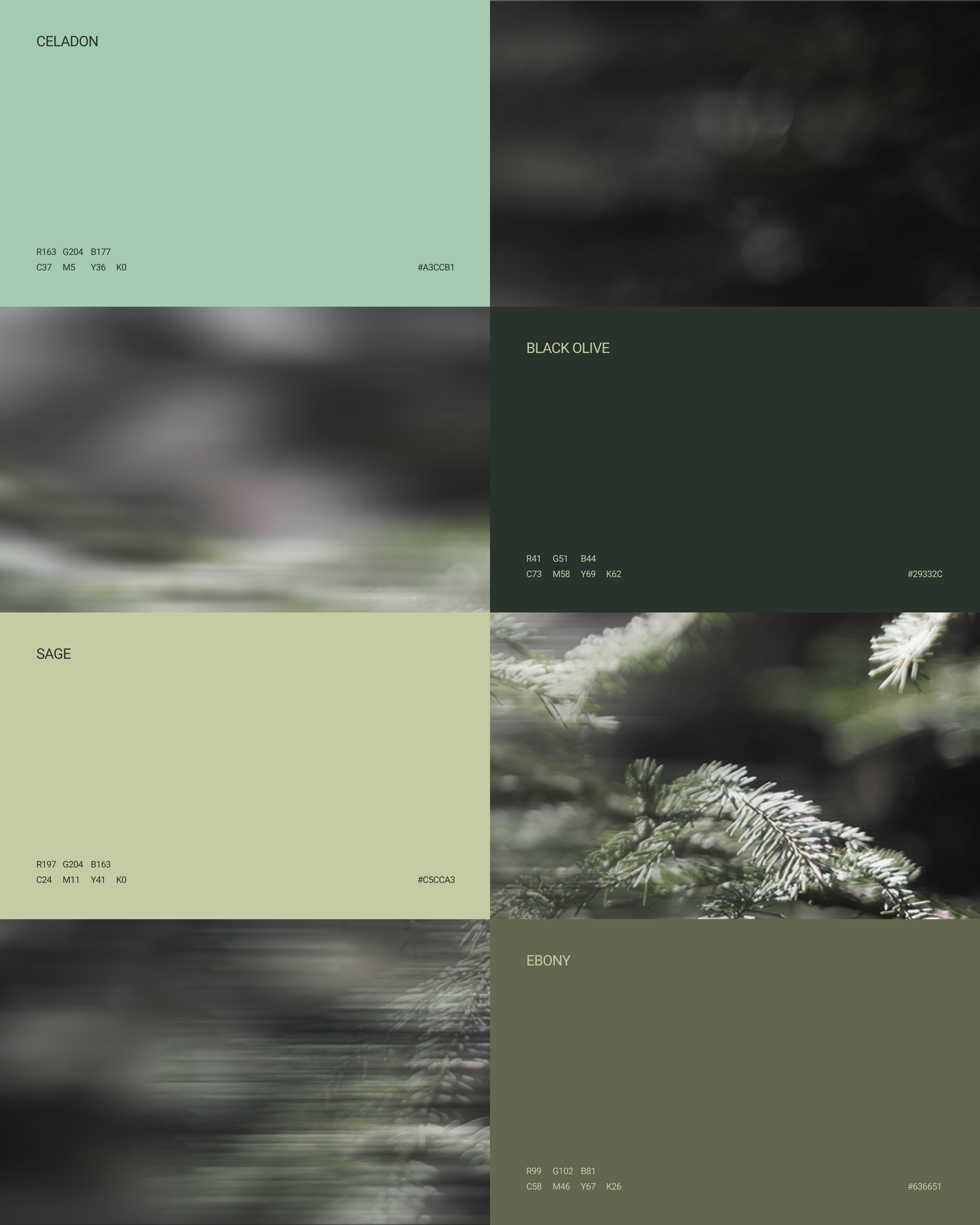
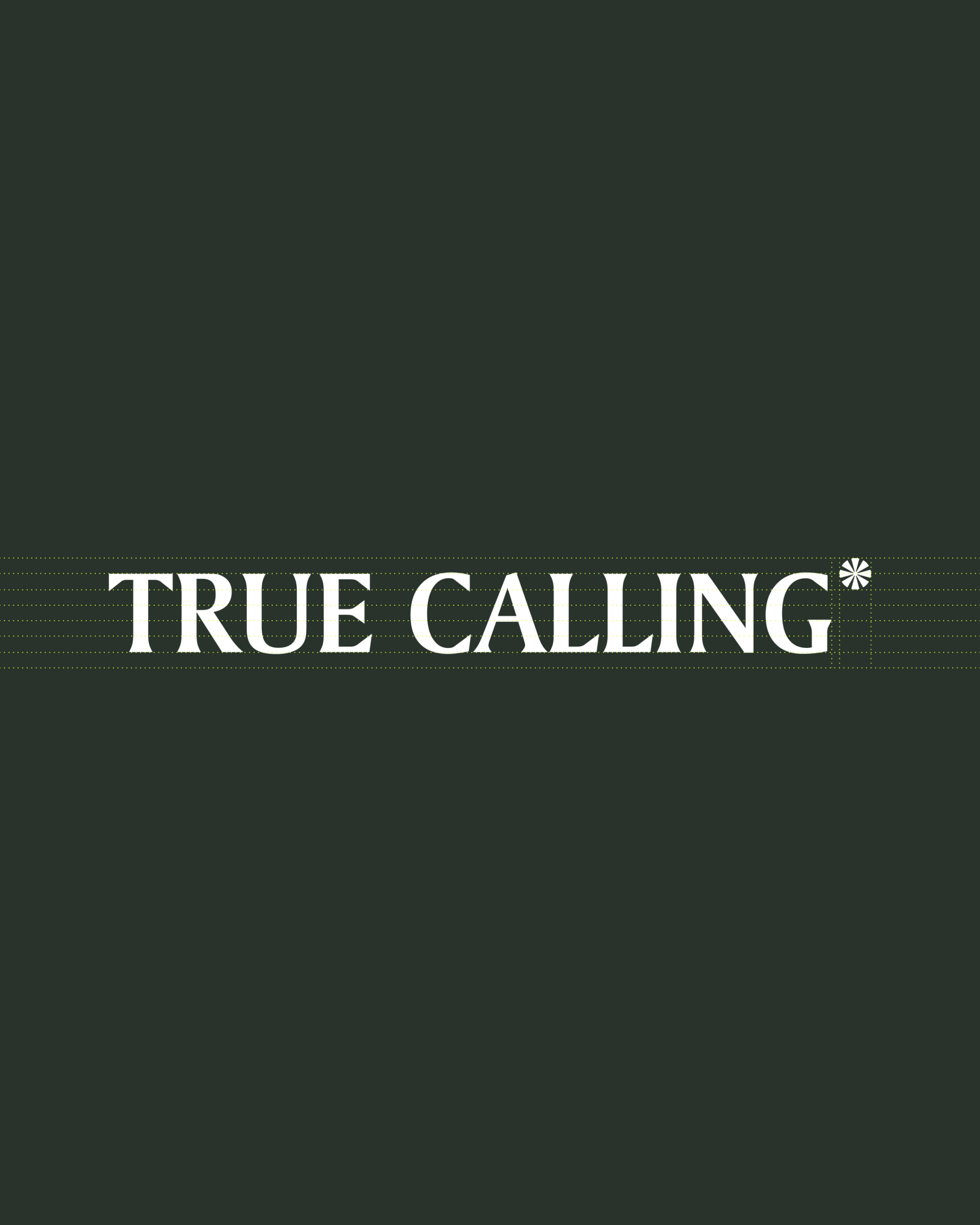
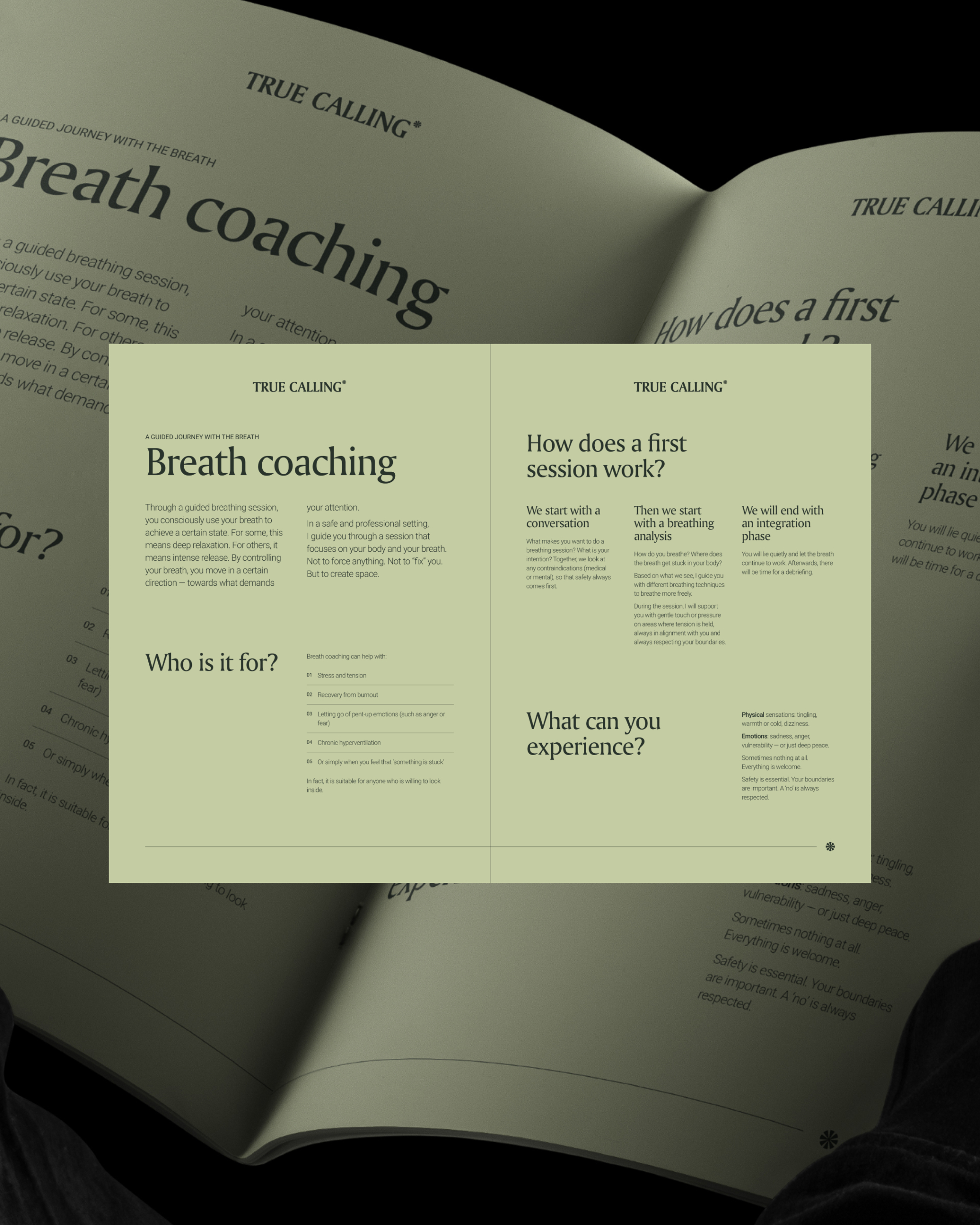
A subtly crafted wordmark with a guiding star symbol. A palette of four green tints, symbolizing growth and trust, anchored by a digital accent color. Typography paired serif headlines with accessible sans-serif body copy, plus a script font for personal touches. Dynamic portrait imagery with motion blur captures growth as a living process, not a static achievement.
Every touchpoint, from the website to printed collateral to social media, reinforced one coherent message: clarity, compassion, growth. True Calling now attracts leaders ready to invest in themselves.